Drawings

Here are some drawings that I did from my chosen image, I used a small range of media to ensure I do not get carried away with them and so that the focus stays on the sections rather than what they are drawn with.

Felt tip pen shadow drawing.


Various Drawing media with different thickness nibs.


Felt tip, section of image.


Painted gouache section.


Painted gouache section.


Ink and bleach section.

Ink and bleach section.


Chalk pastel section.


Chalk pastel section.


Chalk pastel section.


Chalk pastel section.


More Sectioning


I really love this image as the colours are so vibrant, the sky section is my favourite as the colours compliment each other so well. I have started to try out some yarn wrappings looking at the colour proportion in the individual sections to determine the amount of colour in each yarn wrapping.


I continued to try more image selections but nothing really appealed to me as ,uch as the image above. I feel that I am doing these cut outs and drawings simply for the sake of it. From now on I am going to focus on the one image.


David Hockney

After someone suggested I look at surrealism I found that David Hockney's photo montages really fascinated me as the idea of sections is still something that I would like to look at. In particular I like Hockney's 'Blue Terrace, Los Angeles' piece, I love the way the whole image has been separated into sections with a grid as it makes it easier to focus on one section at a time. 

The bottom image (^) is not very clear as it is a photocopy from a book, the separation of the sections makes me want to focus on sections of an image rather the the image as a whole.

Here I have used gouache to create a colour palette for the image shown, the colours are not exact as I was looking the image on the computer screen and when I printed it off the colours were slightly different. The knit sample shown here is an attempt to recreate the image by drawing with the yarns as I knit.

The left side of this image has the same issue as mentioned above, in terms of the colour difference on screen and printed out! The right side of this image was just an attempt to do what Hockney did with the blue terrace image, I quite like the affects it has but I'm not too sure where I could go from this point...

Working with my edited images

So although I have cut out more sections here they look overworked and there is nothing to focus on that makes the image stand out in anyway.


I also tried the 'Less is more' approach in this example, in this case it is not true!


Maybe I need to start focusing on Artists now...

Mixed Media Drawings


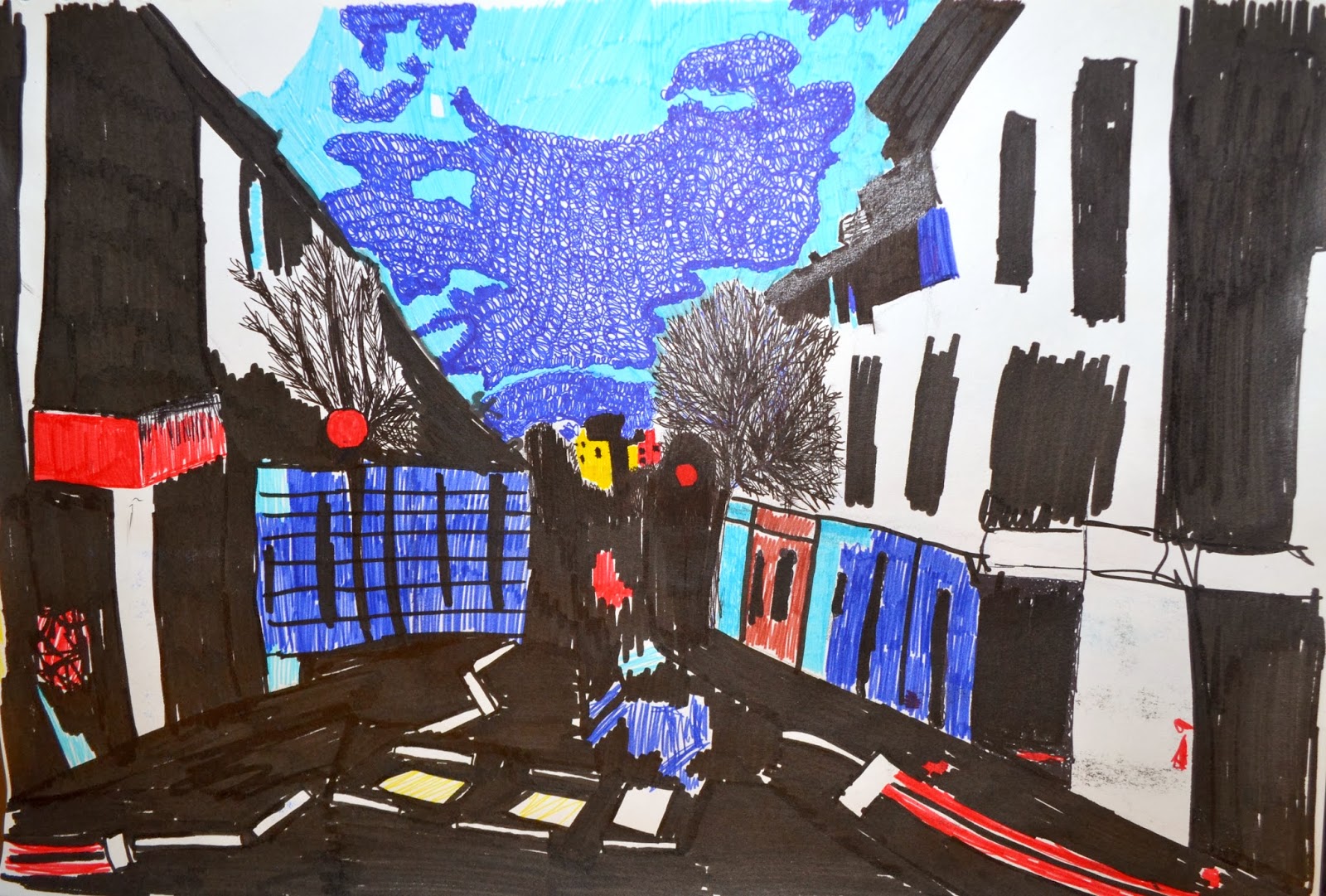
To try and gain some inspiration I decided to do some mixed media drawings, I used my edited images to draw from. I have included the images that I was looking for both drawings,

I really like the textures in this drawing as I have layered it quite a bit, it has two bottom layers of ink and paint which I covered with a piece of black organza, a top layer of gouache and small areas of brown paper.


For this image I used inks and watercolour paints, I like the washed out effect that it has but I feel that I could have done the detail a lot better.


I don't feel like this really helped at all and my project seems to have come to a stand still? I think I may try to go back to the idea of dissecting my images only this time selecting more areas to cut out.

Motivation would be good....


This is a not that I stuck in my sketchbook as I feel very frustrated!

Although I have enjoyed editing my images and changing their state, I feel very negative about this project and I really wish I could find some motivation as I am starting to become concerned as there is only a few weeks left of this unit!

Samples

Now I am somewhat happy with my images I feel like I am ready to start sampling.

The first set of samples were following some new techniques. The colours are not exactly the same as the ones in my images but I was concentrating on the elements of the techniques rather than colour.

This particular sample is quite annoying as the technique includes twisting part of the knitting making it difficult to steam. Putting that aside I am quite fond of the elongated e-wrap technique as it creates a very interesting element to the sample.

This sample was more of a colour proportion sample rather than focusing on a technique I knitted strips of colour.

I quite like how this sample turned out as I attempted to interpret the image shapes with the knit techniques, I do however feel that I need to stop taking such a literal approach to my samples.


After doing these samples I am starting to struggle with a concept, I have not enjoyed as much of this project as I should have by now and I am starting to dread the assessment deadline! I believe that if I find a better concept I will be able to enjoy the last few weeks of this unit!