At the start of this project I was unsure as to what I wanted to look at within the Urban Landscape, I have looked at buildings and urban cityscapes in previous projects so I tried to avoid going back to either of these routes.
It took a while for inspiration to come my way and as I had booked a trip to London I thought this would be a great opportunity for gaining some new ideas. I was advised to go to certain areas of London and look at specific things which included urban areas such as graffiti, I felt uneasy about doing so as I was concerned that this would lead me to focus on a typical urban influence that many people would tend to think of.
Luckily for me I had no idea how to get to those places and ended up lost with a clear/open mind as to what I should look for, this led me to look at the parts of the urban city that people disregard everyday. Initially I photographed various signs and road markings but further into the day I started to look between buildings and down streets that are on the main strips of the city.
I decided to start working from my images by cutting out sections to see what I found interesting about them, I liked the idea of cutting things out and putting them back together and layering different/contrasting images. I felt like it was going no where fast so tried to edit my images to make them seem more appealing. This worked for a while and I attempted various mixed media drawings from them but again this lost its appeal rather quickly.So because I had no idea what to do next I put myself out of my comfort zone and played around with my images using photo editing software and found that by changing the hue and saturation of an image it becomes a whole new photo, this then lead to adjusting the histogram more or less than it should be, I became fascinated with this feature and ended up really liking the outcomes. Feeling positive I started sampling but soon realised I still had no concept or idea of what I was doing so any samples seemed pointless at this stage.
I really had not enjoyed a great deal of this project and was willing to give up on it.
I sat down with my sketchbook and again tried some media exploration and more cut out sectioning of my images, I was advised to look at surrealism after one of my tutorials and this found me being intrigued by David Hockney and his work with photo montages.
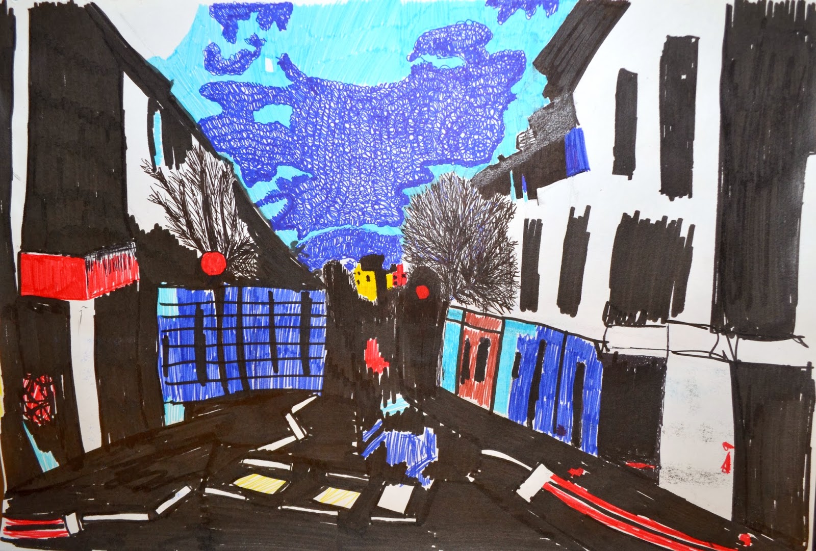
As shown on my blog, in my research folder and in my sketchbook I used his influence on my own images which started to help my work look somewhat appealing to me. After various different ideas had crossed my mind, I came to the decision that I was spending too much time worrying about my outcome that I had completely disregarded any thought of a concept or way to contextualise my work, this lead to me having one main focus point for the rest of the project (see chosen image). I then drew in various ways from the image and when I finally thought I was ready to start my samples it came back to looking at sections of this image and this is shown throughout my samples.
As my samples were quite small due to me looking at small sections I decided to try piecing them together to create a larger scale piece, so after I had done each sample I hooked it back up and knitted off them to attach them to each other, recreating the initial image. This lead to me again trying to contextualise my work and thinking about my samples in terms of where they would fit in the textiles world. As mentioned on my blog I like the idea of creating interior accessories (which I wish to further discuss during my assessment feedback) I feel that this could be an interesting career path as I thrive off the thought that I have produced something useful, that looks good and that always has a purpose in some way.
It had soon come around that it was almost deadline week and I did not leave myself a sufficient time to prepare and complete all of my final samples to standard that I believe to be exceptional, I didn't stick to idea of piecing the sections together as this proves to be rather time consuming and I would not be able to complete enough samples on time if I had continued this idea. I feel that if I had enjoyed the project from the start my samples would have come along in a much more professional way and I truly believe that not enjoying this unit has affected my outcome.
Overall I am somewhat satisfied with my samples as they are true to the images that I wanted to portray, in terms of the project as a whole I have not enjoyed it at all and I hope that in the next unit I can choose a project brief that is better suited to me and that I will enjoy throughout with as little misfortune as possible.
Final Samples
These images show my final 12 samples, I feel that they have been a success and may proceed to knit them together at some point but as I am unsure as to whether each sample will be thought as something different I have kept them as individual samples.
.JPG)
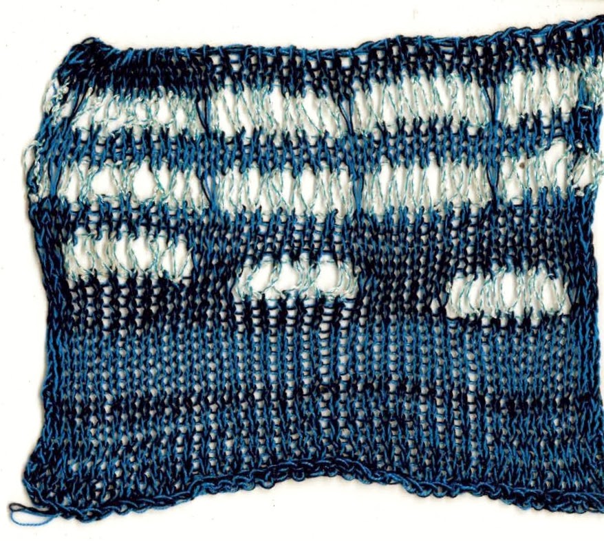
The two tones of blue that I used in this sample are my favourite colour yarns that I have used in this project, I love how well they compliment each other and I think that the pulled e wrap technique is shown really well here.

As I was knitting this piece I realised that the side that I had done the partial knit on was the opposite side to the part of the image I was looking at, with this in mind I carried on and was happy with the outcome and quite like that it is the 'wrong' way around.
.JPG)
This is one of my more simple samples and I like how the two tone knit has a different effect every time. I am pleased with this sample, in this case less is definitely more.
.JPG)
This sample was not intended to be so plain, but I had a minor crises and i was unsure how to create the look of the image without being too literal or too abstract, I eventually decided that to create the colour changes I would use partial knit with hold and simply hooked the separate colours back onto the machine and knitted them together.
.JPG)
In this sample I feel there is a very literal element to it which initially I tried to avoid, I think overall I have found a good balance between the collection of samples in terms of literal and abstract.
.JPG)
This is one of my least favourite samples as there is not a lot going on in terms of colour, if it wasn't for me trying to follow the sections this could have been a lot more interesting.
.JPG)
This sample is by far one of my favourites! I love how it looks just like the image I was working from and I feel that the colours are exactly how I wanted them to be.

I quite like the simplicity in this sample as although it is just a basic sample the yarn choices seem to comploment each other in a great way. I also like the hand sewn finish where I was unsure how to add such a delicate amount of red on the knitting machine.

I am unsure how I feel about this project as I am starting to feel like I have over used the pulled e wrap technique. I still love the result of it but maybe next time I should think of a alternative instead of using the same technique so much.

I love this sample as it has a likeness to the section I was focusing on but at the same time has a great style to it, I am extremely pleased with the outcome of hooking the piece back onto the machine to create a grid like effect.

Again here I am unsure of the use of the pulled e wrap technique, however the normal e wrap strip to me is the best part of the sample as it has a wonderful texture.

I am pleased with outcome of this sample as simplicity wins in this case, I feel like there could be a lot more going on but it could ruin the whole piece.
Overall I am very pleased with my final outcome as I didn't think they would turn out this well considering I have not really enjoyed the project as a whole.
Final Samples prep
For my final samples I have prepared my image into the different sections that I plan on knitting, Each knitted piece will represent one final sample and have representation of the section of the image chosen. Here are the chosen sections:
.JPG)
.JPG)
.JPG)
.JPG)
.JPG)
.JPG)
.JPG)
.JPG)
.JPG)
.JPG)
.JPG)
.JPG)
.JPG)

.JPG)
.JPG)
.JPG)
.JPG)
.JPG)
.JPG)
.JPG)
.JPG)
.JPG)
.JPG)
.JPG)
.JPG)
.JPG)

Let the knitting begin...
Contextualising my work
I am now thinking about where my work will fit into the world of textiles, as I have always had an interest for the interior side of things, I decided that maybe interior accessories would be a good place to start...
I thought about various basic interior accessories such as lamp shades, throw blankets, cushions, cushion covers, rugs etc.
If I had more of an idea of what I wanted to focus on earlier on in this project I would have tried to create more samples that could be seen as more of the items listed above, however for this projects samples I think cushion covers would be a suitable thing to put my designs/samples on. Although the quality of these edited images is far from perfect I am happy with the outcome of this idea:
 This is my favourite cushion sample as there is more going on than in the rest, I do however feel that it would be better it the shape of the knitting matched the shape of the cushion.
 I quite like they was this sample looks on the cushion as it looks as though it has been enlarged.

Although this is one of favourite samples I don't like how I have lost some of the knit when cropping the image, I do think it shows the best part of the sample though.

I really like that there is quite a lot of detail in this sample when you see it close up, I'm happy with this piece but I could like for the edge of the knit image to be less sharp.
I thought about various basic interior accessories such as lamp shades, throw blankets, cushions, cushion covers, rugs etc.
If I had more of an idea of what I wanted to focus on earlier on in this project I would have tried to create more samples that could be seen as more of the items listed above, however for this projects samples I think cushion covers would be a suitable thing to put my designs/samples on. Although the quality of these edited images is far from perfect I am happy with the outcome of this idea:


Although this is one of favourite samples I don't like how I have lost some of the knit when cropping the image, I do think it shows the best part of the sample though.

I really like that there is quite a lot of detail in this sample when you see it close up, I'm happy with this piece but I could like for the edge of the knit image to be less sharp.
Putting sections together
After my initial samples I was drawn to the idea of knitting the sections of image focusing on significant elements of each section, however I also thought it would be interesting to try knitting the sections together to make one larger piece of knit, almost like patchwork maybe?


I got as far as knitting 10 individual sections of the image, I then hooked each piece back onto the machine to knit them all together and create a larger piece, below is a picture of the 10 sections knitted together.

I feel that this outcome has been a success as it looks better than I imagined it would, although the piece looks better in person I am now left thinking about what it could possibly be used for in the textile industry....
Samples
I have started to do some samples using various sections of the image as inspiration, I made a plan for each sample which included yarn colour, techniques and layout. (see sketchbook)


I really like the pulled e wrap technique, I think it has a great effect and could be used to interpret a wide variety of sections in my work. Although I have steamed this sample the variation of the positions of e wrap had affected the shape of this sample.

I don't really like this sample at all, it seems pretty pointless as it is so small, I do however like the effect of partial knit on the bottom left corner but I am not sure this works well at this point.

In this sample I have simply e wrapped different colours in, I quite like the finished effect but unfortunately the casting off on this sample is too tight and has warped the shape slightly.
This is definitely one of my favourite samples as the colours are lovely, and the pulled e wrap technique really flatters the sample.

I am not sure how I feel about this particular sample as there re a few mistakes that I recovered, I think if I had used a tighter tension to darker blue knit would look much better.

I really like this sample as rather than looking at any specific detail in the image I focused more on the colours that were in the section, I love the inlay of the red and yellow yarn at the bottom.

This sample was aimed to have a more simple look and I feel that it has worked really well and this sample had a beautiful texture.
Drawings
Here are some drawings that I did from my chosen image, I used a small range of media to ensure I do not get carried away with them and so that the focus stays on the sections rather than what they are drawn with.

Felt tip pen shadow drawing.
Various Drawing media with different thickness nibs.

Felt tip, section of image.

Painted gouache section.

Painted gouache section.

Ink and bleach section.

Ink and bleach section.

Chalk pastel section.

Chalk pastel section.

Chalk pastel section.

Chalk pastel section.
Subscribe to:
Comments (Atom)