I started to edit the levels via adjustments and realised that if I changed the levels on the histogram more than needed it made quite the difference on the colour and saturation on the image, I found this quite interesting as the colours became more vibrant!
This image shows the a side panel on a telephone box, there was a pattern on the glass which helped to create this lovely image. Although I really like this image I don't feel inspired to take it any further in terms of sampling.

I took this image whilst on a bus in London, I feel that it works well as an image on its own but I don't think that it compliments my other images in any way.

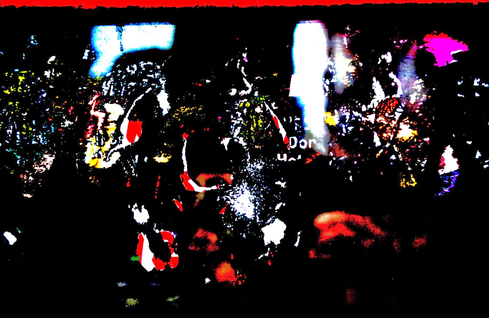
This image is probably one of my favourites, I'm not entirely sure as to why but I love the was the zebra crossing really stands out! The colours in the shop windows are so 'loud' but still the crossing stands out.

Looking at this image actually inspires me a lot as I find the colours to be very appealing! I like the proportion of them and feel they could inspire some great samples.
Feeling much happier about my images I decided to experiment with image transfer liquid, I was unsure what the outcome was going to be and I feel pleasantly surprised. Here are the outcomes...


I feel that this image has transferred really well and almost looks exactly like the original image, although this may be a good result I am not looking for a literal approach.

This sample is one of the poorer attempts, I don't like a single thing about it.

On this sample I didn't leave the image on long enough and almost the whole thing has come off, all in all a terrible sample.

Out of the five samples this one is definitely my favourite! I love how some of image hasn't quite transferred properly but still has given a great image.

I tried to use a more transparent fabric to transfer onto and I think it has worked quite well but the colour has lost a lot of vibrancy.
No comments:
Post a Comment